Case Study: Roscato Cans

Client:
Palm Bay International
My Role:
Art Director & Lead Designer
    Contributions:
    • Competitive Review
    • Concept Creation
    • Product Renderings
    • Mechanicals

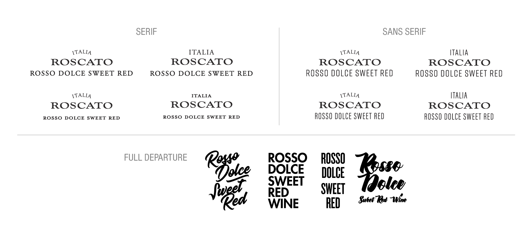
    In response to a growing market, Roscato opted to extend its traditional glass line by launching single-serving cans. The new packaging design aimed to differentiate itself in a category known for its creative designs while staying true to the brand identity appreciated by loyal Roscato consumers.

    With these considerations in mind, the new design retains the typography and layout of the glass packaging. It also introduces a bold new pattern inspired by the logo, aiming to establish a fresh Roscato format that remains recognizable yet innovative.

    Expanding into Can Packaging

    The redesigned Roscato can packaging is aimed at entering a design-forward market while coexisting harmoniously with the original 750ml glass packaging.

    Competitive Review

    An overview of the market trends at the time, identifying common themes across the can packaging landscape for wine, ready-to-drink beverages (RTD), beer, cider, and hard seltzer products.

    Design Exploration

    The objective of this exercise was to explore the stylistic limits of the Roscato brand before refining it for final execution. During these exploration phases, I analyzed elements such as patterns, tactile textures, scale, color, and typography choices.

    Original 750ml Glass Bottle Label

    Mechanicals

    Direct-printed can packaging, following TTB wine labeling regulations.
    Back to Top